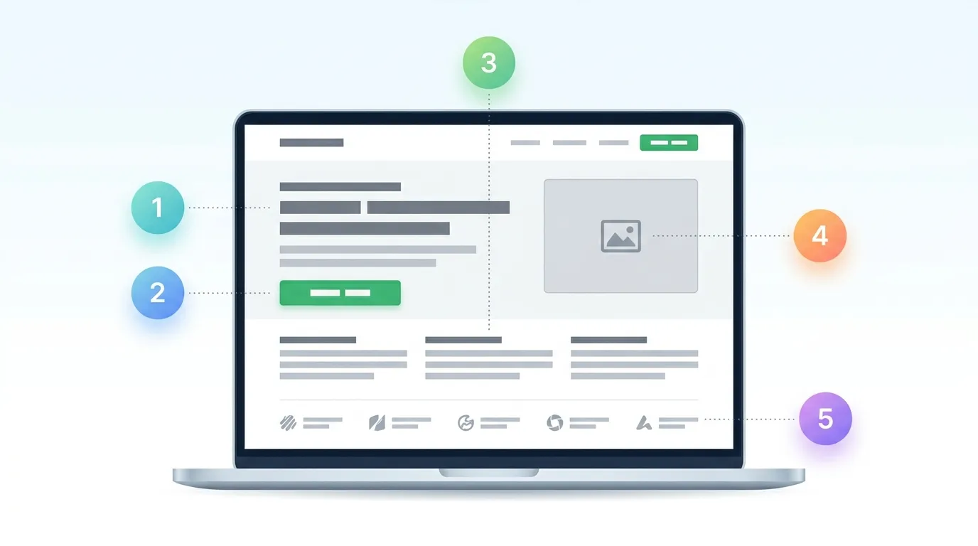
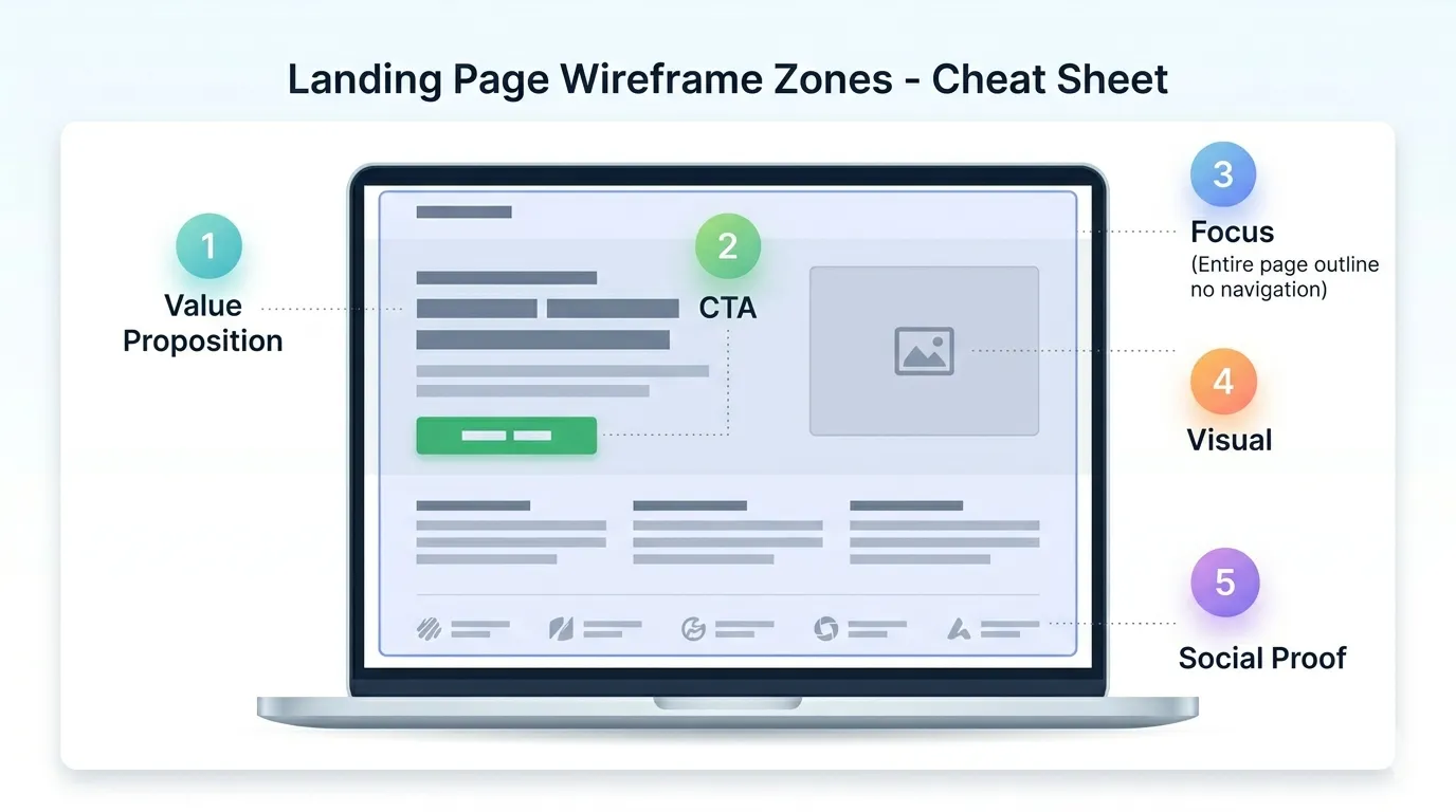
A landing page is different from a regular website in one way — it has one specific goal. A signup, a purchase, a registration. Nothing else.
Usually you send people to a landing page from ads or emails. And if the page doesn't work — money goes out, but nothing comes back. Let's look at the five elements that determine whether a landing page converts or not.
A Clear Value Proposition
Someone opens your page and they have about 3 seconds to understand — is this what they're looking for? If the headline doesn't make it clear, they close the tab and move on.
A value proposition isn't a fancy tagline. It's a short statement: what you offer and why it matters.
Examples
Shopify: "Sell online with Shopify" — four words, everything is clear.
Webflow: "Build better business websites faster, without coding" — you instantly know who it's for.
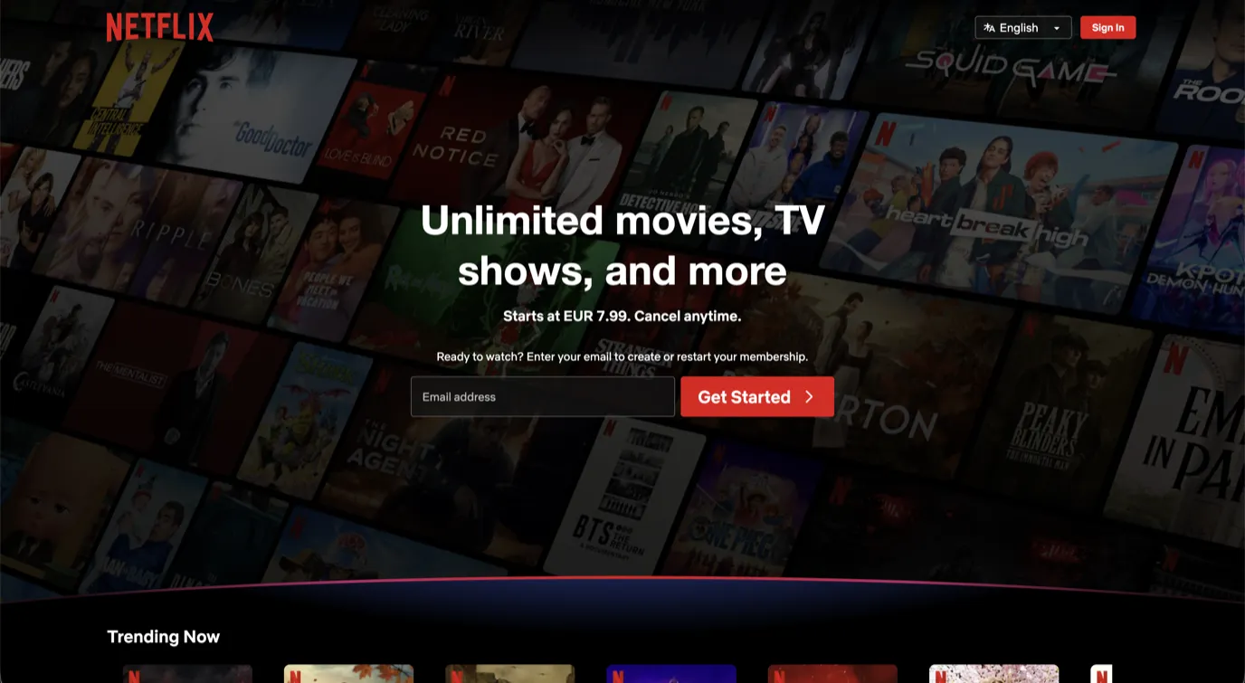
Netflix: "Unlimited movies, TV shows, and more" — instantly clear what you're getting.
Quick test: if someone sees only your headline and nothing else — do they get what you do? If not, it needs work.
A Strong Call to Action (CTA)
A visitor might be interested, but if they don't know what to do next — they'll just leave. A CTA is a button or link that says: "Do this now."
It needs to be visible right away, not buried at the bottom somewhere.
Examples
Shopify: "Start your free trial" with an email field right next to it — zero friction.
Webflow: "Get started — it's free" — instantly kills the price objection.
Netflix: "Get Started" with an email field right next to it — simple and frictionless.
Common problems
- CTA is hidden at the bottom of the page.
- Vague wording like "Learn more" — learn about what?
- Too many buttons competing for attention.
Ideal setup: one main CTA at the top, same one repeated at the bottom. That's it.
Focus — Nothing Extra
A regular website is like a supermarket — lots of paths, lots of choices. A landing page is the opposite — one room, one door.
If your page has navigation with seven links, a sidebar, blog recommendations, and social media buttons — the visitor gets distracted and forgets why they came.
What the best brands do
Shopify: no navigation at all. No other links, just the CTA.
Netflix: no navigation. Only "Sign In" for existing users.
Hootsuite: no navigation. Just plan comparison.
The pattern is obvious — the best landing pages remove navigation entirely. No way to leave, only the way forward.
In practice
- Remove navigation or keep only the logo.
- Don't link to other services or blog posts.
- One goal = one action.
A Visual That Does the Talking
We process images much faster than text. A good image on a landing page does two things: it shows what the visitor will get, and it creates an emotional pull.
Examples
Shopify: the image shows an online store with products and analytics — instantly clear this is an e-commerce tool.
Webflow: you see a design interface — you understand it's a website builder.
Netflix: a massive content grid in the background — creates the feeling of endless entertainment.
A good image amplifies the text, it doesn't replace it. And definitely avoid generic stock photos of smiling people that have nothing to do with your offer.
Social Proof
We trust what others are doing. If thousands of people use a product — we assume it's good. That's social proof.
Examples
Shopify: "Trusted by over 1 million businesses worldwide" — one sentence, instant trust.
Webflow: a logo bar of major companies — if they trust it, you can too.
Netflix: doesn't use traditional social proof, but they're Netflix. Sometimes the brand itself is the proof.
What you can use
- Client testimonials with names and companies.
- Logo bar: "Trusted by:"
- Numbers: "500+ projects" or "98% of clients return."
- Brief case studies with results.
Even 3–5 genuine testimonials make a noticeable difference.
Summary
An effective landing page isn't complicated. It's simple, focused, and strategic:
- Clear value proposition — 3 seconds to understand who you are.
- Strong CTA — visible, clear, drives action.
- Focus — nothing extra.
- Visual element — shows and engages.
- Social proof — others' trust reinforces your offer.
If your landing page isn't converting — review these elements one by one. The problem is usually in one of them.
Want to talk about how to apply these principles to your website? Get in touch. First conversation is free.